Saturday, 7 April 2012

Evaluation Question 2

How effective is the combination of your main product and ancillary texts?


For my media coursework, my brief was to create a selection of materials related to an original children’s TV drama, to include the title sequence to the TV programme, together with: the front cover to a magazine for the series and a DVD cover for the series. These three products are all promoting the same thing, and therefore must be closely connected.
I have tried to integrate my products as closely as possible. I had to make sure that continuity was used between the three products, otherwise they would not work together to promote the TV programme. One way that I linked my products was to use the same logo for the programme. These are the logos as they appear on my products:

Magazine logo:


DVD Cover logo:


Video logo:


I have used the same logo on my magazine and DVD cover, which I produced on publisher, however I was not able to use the same logo on my video. The reason for this is because my logo was produced on the website http://fontspace.co.uk and had to be copy and pasted onto my publisher products. In “imovie” (the editing programme used for my audiovisual product) the only fonts that could be used were the pre-set ones. This meant that I could not use the same logo on my video as my ancillary tasks. This did let the continuity of my three products down and this was commented on in my audience feedback.


The colour scheme for all three of my products was very similar. I decided to use the colour of each character in the colour scheme of my product. This makes it bright and colourful for my target audience and by using the same colour scheme it combines my products more. I have used the font “HOBO STD” in all three of my products to allow them to be linked. When people see the font on one product, they can immediately connect it to the other products. Here is an example of how I have used fonts in my three products:

Magazine:


DVD:


Audiovisual product:


In my products, I have not used the same images as this would be boring. In my ancillary tasks I have used similar images to keep the products related. This has allowed me to create a brand identity for my product. This has a positive effect as people will associate my products with one another and be interested in all of them. This makes my products more popular and promotes the TV series better.

Continuity throughout my product has also helped me to create a brand identity. Using the same mise-en scene, costume and props for each character throughout each of the three tasks has kept my characters recognisable. This is important because the mise-en scene of each character is quite obvious and the audience notice any changes that are made and not continued throughout. For example, the character "Bridget" wears large, black glasses and wears her hair in pigtails. These two elements act as signs to the audience of what type of character she is and without these, the audience would not recognise the stereotype. Here is an example of how i used continuity between my three products:

Magazine:


DVD Cover:


Audiovisual product:


My package is intended to market a specific product, a children’s TV series. I think my package markets this product well. The opening sequence provides a nice introduction for the programme that will interest the audience in the characters and make them want to watch more. My magazine is very suited to my target audience and allows them to get behind the scenes access to the programme. This makes them feel more involved and therefore more interested in buying the product and watching the series. My DVD cover also promotes my product well as it makes the programme look fun and exciting for the audience. The use of conventions, technologies, layout and production all allow my package to promote the product to a high standard.


The use of diffferent types of media have affected how my products have appealed to the target audience. Magazines and DVD's are types of media that are very popular and appealing to children. Therefore, using these items in my ancillary tasks has helped me to reach my target audience. Magazines and DVD's can be purchased for the children by parents or with pocket money. Therefore, they are easily accessible to children. Other types of media, such as websites or digi-paks are not so commonly used by children. A lot of young people don't have access to the internet - and even if they did they may not be able to use the service properly. This would make it useless for me to have created one of these media products. Magazines and DVD's are the most appealing type of media for children. Magazines include lots of puzzles, prizes and activities which can make the children feel involved in the programme, and therefore more likely to watch my product. DVD's have the same effect. The bonus features and behind the scenes action can make children feel involved with the characters.

My print adverts would be placed in similar products. Placing the adverts on these products means that they will be easily seen by the target audience. When children are reading through their usual magazines, they will see the adverts for my products and may be interested in buying them. Here is an example of how print media can be advertised within similar products?

My audiovisual product will be advertised during the commercial breaks on children's TV channels. This is an easy way to reach my target audience. By showing my opening sequence at this time, my target audience will already be immediately engaged into my product and they will become aware of it. This is often done with similar products on children's TV channels to advertise new programmes.

Friday, 6 April 2012

Evaluation Question 3

What have you learned from your audience feedback?

I decided to gain my audience feedback in a variety of ways. One of the techniques I used was creating a survey on the website Survey Monkey. Here is the survey I created.


Create your free online surveys with SurveyMonkey, the world's leading questionnaire tool.


I was able to gain a lot of audience feedback from my survey. It was anonymous way of people commenting on my products, so it attracted more responses than other methods. When analysing the results of my survey, I found that two thirds of the people that responded to my survey were female. This can mean two things; my products appealed more to females or females were more interested in responding to surveys. I have produced a graph to show the results of the question on age in my survey:

   
When asking people if my three products were appealing to them - I was amazed at the results. On all 3 questions, 100% of people said each of my products appealed to them.

This shows that my products meet the needs of the target audience. The reason for asking why these products appealed to them was to see some of the strengths of my products and what made them instantly appealing to the target audience. The reasons people gave for my magazine being appealing were: the use of bright colours, the use of images and the attractive cover lines. The reasons people gave for my DVD cover being appealing were: the use of logo’s, the colour scheme and the similarity to existing products. The reasons people gave for my video being appealing were: the mise-en scene of each character, the theme tune and the name of the character appearing on the screen. These points were also reflected in the question on the strengths of my products.
When asking about the weaknesses and what could be improved in my product, the answers were similar. I found that people would have preferred if I had put the DVD cover as one product, not split in half as the front and the back. One comment also said that the editing was not as fast paced as they would like which is something that could be improved. I feel however, that if I had made the editing more fast paced then the video would have lost some of its meaning and the characters would have not been shown so clearly.
My survey has been very useful in finding out the strengths and weaknesses of my products.


I also used social networking websites such as Facebook and Twitter to share my products and receive audience feedback. These websites were also used to share my survery.


After posting a link to my blog and asking people to comment, I received the following comments:


From this, I could see that people liked my products and thought they would appeal to the target audience. The colour scheme seems to have impressed people and the way that my three products link in together. However, there have been no comments on how to improve my products.


Another method of audience feedback I decided to use was carrying out a focus group. For this, I interveiwed 6 children between the ages of 7 and 15. I showed them my video and then asked them all the same questions on what they thought of my main task. Here is an example of one participant of my focus group.


From my focus group, I was able to gain first hand knowledge of what people thought of my product. I learnt some strengths and weaknesses of my product from what the children told me. The strengths included: the upbeat theme tune, the mise-en scene of each character and how they are introduced, and the transitions between each character. The mise-en scene of each character is something I worked very hard to make look good, so I am pleased it has come up as a strength. Some of the weaknesses that my focus group pointed out was that the video seemed to flow quite slowly and was not as fast paced as similar openings and also some of the younger children in the focus group thought that "Razzle's" scence was nasty. They may not have understood the humour to this. Another thing I learnt from my focus group was that the participants thought my video was similar to other products on the market at the moment. This is pleasing to me as it means I have followed the conventions well and created a product that fits in with the needs of the target audience.    


Overall, I feel that my products have appealed to my target audience very well. In my survey 100% of people said all of my products appealed to them. In my focus group, I also found that a sample of my target audience found my product very appealing. The reason for this may be that I tried to follow as many conventions of similar products as possible to make a more successful product.
From my range of audience feedback, I have been able to identify some strengths and weaknesses of my products. The choice of colour in my ancillary tasks seemed to be one strength that appealed to my target audience. Particularly in my magazine, the colourful cover lines seemed to be the most appealing to the target audience. In terms of my video, one of the strengths highlighted by my audience feedback was the way each character was introduced, in particularly the mise-en scene of each character. This seemed to appeal to my target audience as by getting to know each character, it made them feel more involved in the programme.
The main weakness in my ancillary tasks seemed to be that the DVD cover was presented on my blog as two pieces, when it should have been joined together as one. This seemed confusing for some members of my target audience and it had to be explained to them that the second piece was the back of the DVD cover. This is something I decided to immediately change when reveiwing my products. It seemed very important to my target audience and I beleive it makes my ancillary task look more professional. A more minor weakness that some people commented on was there was no use of smaller images on the magazine front cover. I learnt that my target audience would have preferred this.

My three products clearly have their weaknesses and can be improved to suit the target audience more. However, I feel I have produced three high quality products that meet the needs of my target audience well.

Friday, 16 December 2011

Magazine Cover Drafts

Basic magazine drafts:


Drafts with fonts and colour schemes


DVD Cover Drafts

Basic DVD cover drafts


Drafts with colour schemes and fonts


Draft of the DVD back cover


Colour Scheme

Possible Fonts

Story board


Script

Scene 1 - school corridor
Razzle, AJ, Max, Bridget and Emily are walking down the corridor chatting
The school bell rings
Razzle, AJ, Max, Bridget and Emily all run off in different directions

Scene 2 - school feild
AJ throws a ball and then cathes it back
Zoom into AJ holding the ball

Scene 3 - school classroom
Bridget walk past the puzzled teachers and puts the corect answer to the question on the board
Zoom into Bridget smiling

Scene 4 - the front of school
Max skates towards the school, he then stops, flips the skateboard and catches it
Zoom into Max looking cool

Scene 5 - school corridor
Emily walks down the school corridor and gives two girls a funny look. She then gets a mirror out and applies lipstick
Zoom into Emily applying her lipstick

Scene 6 - school classroom
Razzle throws a paper aeroplane, which then flies back and hits him in the face
Zoo into Razzle laughing

Scene 7 - school corridor
Razzle, AJ, Max, Bridget and Emily run into the corridor
All link arms and walk down the corridor together

Shot List


Shot
Scene
Type of shot
Description


1


1
Wide angle shot / long shot
All the characters are walking together down the corridor. The shot is slightly high angle to show all of the characters. The shot is a long shot to show the setting

2


2
Long shot / close up
This shot introduces AJ. It starts with a long shot of him throwing and catching a ball. once he's done this, the camera then zooms into a close up of him smiling

3


3
Long shot / close up
This shot introduces Bridget. It starts with a long shot of her going to the board and writing on it. The camera then zooms in to a close up of her smiling

4


4
Long shot + wide angle / close up
This shot introduces Max. It starts with a wide angled long shot of him skating into school. We then see Max flip the skateboard up and cath it. The camera then zooms in to a close up of Max smiling

5


5
Long shot / close up
This shot introduces Emily. It begins with a long shot of Emily walking down the corridor and then zooms into a close up of her applying lipstick

6


6
Mid-shot / close up
This shot introduces Razzle. It starts with a mid-shot of him throwing a paper aeroplane and then being hit with it. The camera then zooms out to show him laughing

7


7
Wide angle shot / long shot
All the characters are walking together down the corridor. The shot is slightly high angle to show all of the characters. The shot is a long shot to show the setting

Risk Assesment

Scene 1 - school corridor
Tripping hazards - make sure the area is safe and clear. Make checks before filming
Other students pushing - film at a quiet time when other students are in lessons

Scene 2 - school field
Slipping hazard - wear fooball boots to prevent slipping
Tripping hazards - make sure the area is safe and clear. Make checks before filming
Accidents with the ball - practice before and be careful

Scene 3 - school classroom
Tripping hazards - make sure the area is safe and clear. Make checks before filming

Scene 4 - front of school
Use of a skateboad - practise before. Film on a dry day when the ground won't be slippery. Wear protective gear under clothing

Scene 5 - school corridor
Tripping hazards - make sure the area is safe and clear. Make checks before filming
Other students pushing - film at a quiet time when other students are in lessons

Scene 6 - school classroom
Tripping hazards - make sure the area is safe and clear. Make checks before filming
Use of the paper aeroplane - throw it gently and practice before

Scene 7 - school corridor
Tripping hazards - make sure the area is safe and clear. Make checks before filming
Other students pushing - film at a quiet time when other students are in lessons

Tuesday, 13 December 2011

Production Plan

Dates of filming
7th of January
14th of January
21st of January
28th of January

Personnel
Oliver Flitton/Jamie Francis - cameramen
Jas Ford - director
Anton Kavaliouskas as AJ
Jamie Francis as Bridget

Oliver Flitton as Max
Jas Ford as Emily
Jack Baker as Razzle

Locations
All filming will take place at Neale Wade Community College
The specific locations we will use are:
- the corridors
- classrooms
- the school field
- front of the school

Equiptment
Camera
Tripod
Camera charger

Costumes
AJ - sports kit and trainers (white tshirt and black shorts)
Bridget - smart school uniform, tie and top button, glasses with hair in pigtails
Max - shirt and tie, made to look scruffy in a cool style. Sleeves rolled up. Trainers
Emily - school uniform, shirt instead of trousers. Pink cardigan and ballet pumps
Razzle - School uniform which is one size too small. Shirt untied to match his scruffy appearance

Props
Characters costumes
Paper aeroplane
Glasses
Pen
Pocket mirror
Lipstick
Watch
School bags
Football
Jewellery

Planning

For our main task, we are producing the opening to children's TV series. We have deciced to make a childrens TV drama based in a school. The programme will feature 5 main characters who all have very different personailities.


Characters:


AJ
This character is a sporty boy who loves being enerjetic and taking part in activities


Bridget
The stereotypical geek of the group. Bridget loves learning and is very intelligent


Max
The "cool" guy in the school. He can be seen as a show of but is very popular and all the girls love him


Emily
This character is a stereotypical "girly-girl". Emily takes great care of her appearance and loves the colour pink


Razzle
The "class clown". Razzle is always getting into mischeif and often is the cause of his own misfortune

Saturday, 10 December 2011

Audience Feedback Summary

Focus Group

For my focus group I used a group of children aged between 8-11 as from my questionnaire I learnt that these are the age group of children that watch childrens television drama.

I showed them the opening sequences that I have analysed (Sabrina the teenage witch, Sleepover club, Zeke and Luther) and asked them what they liked and didnt like.

Sabrina the teenage witch

  • 100% thought that the opening sequence could of been longer
  • 85% thought that more than one character should of been introduced
  • 40% said that more colour could of been used, as it looks quite dull as you watch it
  • 60% likes that the logo was shown at the start of the opening sequence

Sleepover club
  • 100% liked that each character was represented with a different colour to match their personality
  • 95% liked the theme tune and the lyrics that go with it as they thought that the lyrics were very fitting for the programme and the backing track was upbeat and fun
  • 75% thought it was good that the cast included boys and girls
  • 100% said they liked that each character was introduced individually
  • Only 15% said that the bubble effect made them want to carry on watching, 85% said it was distracting and too bold

Zeke and Luther
  • 60% thought that the editing of this opening seuquence was too fast paced
  • 100% liked that the logo of the programme was clearly shown at the end of the clip
  • Only 35% liked the chequered effect of the special effects behind the actors names as they appeared on the screen
  • 80% thought it was good that a few of the main characters were introduced in the opening
  • 75% liked the theme tune to this opening sequence, they thought it was catchy and upbeat

I then explained a breif description of the ideas for my opening sequence and what they liked and disliked. They gave me their feedback:
  • They all liked the idea of introducing each character as an indivdual, in sepearte scenes
  • They don't think it should be too long, otherwise veiwers may loose interest
  • They thought it was a good idea to have a fun, upbeat theme tune
  • They said I should definately show the logo of the programme at the end of the opening sequence
  • They said my general ideas were good and they would like to watch my finished product

Survey Results

After analysing the results from my surveys, I was able to find out key information about my target audience about what they look for in a product.


I have found that:
  • The majority of my target audience are female
  • My target age group will be mainly 8-11 year olds
  • The majority of my target audience are interested in school and friends
  • Nickelodeon and the Disney Channel are most watched among my target audience
  • A mixture of characters (girls, boys and adults) are preferred in a TV drama
  • The preffered length of an opening sequence was between 1 minute and 1 minute 30 seconds
  • 84% of my target audience prefer a few of the main characters to appear in the opening sequence, as opposed to all of the characters
  • A catchy tune was preffered by my target audience
  • My target audience wanted the setting of the opening sequence to relate to the programme

This image shows that most of the people that answered my survey were females. This suggests that I may need to aim my product slightly towards females as they would be more interested in my products. It would be a waste of time aiming the products more at boys if they are not going to be interested.  


This graph shows the age distribution of people who answered my survey. Noone who fell into the youngest category (0-3) or the oldest category (16+) answered my survey, so I will not be aiming my product at them. The most common age category of people answering my survey was 8-11 so I will be mainly aiming my products at them. My products will be suitable for children of all ages, but they will be mainly directed at this age category.


This graph shows what other TV channels my target audience watch. Nickelodeon and the Disney Channel are the most watched channels by my target audience. This shows that I need to create a programme that fits in with similar products from these channels. Disney XD was the least watched channel among my target audience so it would be a waste of time to focus heavily on the programmes produced by this channel.
  

This image shows the type of characters that my target audience like to see in a TV drama. The results show that a mixture of boys, girls and adults is preferred. I will take this on board and aim to include characters from these three groups in my final audiovisual media product.


I also found out what my target audience would like to see in the products of my ancillary tasks:
  • The title of the DVD, an image and the logo of the programme were all things that my target audience wanted on a DVD front cover
  • Half of my target audience wanted 5 or more characters on the DVD front cover
  • A variety of colours was the chosen colour scheme from the target audience
  • For the magazine front cover, the target audience only wanted to see 1 or 2 characters on the cover
  • A variety of colours was, again, the chosen colour scheme
  • An image, cover lines and the magazine logo were things that 100% of my target audience wanted on a magazine front cover
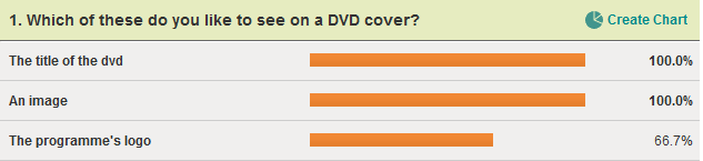
This image shows the answers that my target audience gave to the question of what they would like to see on the DVD cover. All of my target audience definately wanted to see the title of the DVD and an image to illustrate the DVD cover. The majority of people that answered my survey aslso wanted the logo of the programme to be on the DVD cover. If i want my product to be successful with my target audience, I must make sure that these items are featured on my DVD cover.
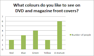

This graph shows the colours that my target audience would like to see on a DVD and magazine front cover. All of the suggested colours were popular among the target audience. However, all of the people answering my survey said they would like a mixture of colours. I think it would be best to use a mixture of the suggested colours to appeal to my target audience.


This image shows the amount of characters my target audience would like to see on the front cover of the magazine. Noone who answered my survey said they wanted to see more than 5 characters on the front cover of the magazine. The most popular answer was one main character. This suggests that for the magazine front cover, I should create an issue that focuses mainly on one of the characters.  


I can now use all of this information to plan and produce my products with a clear veiw of what my target audience are looking for, making my product more successful.